pacman::p_load(rstatix, gt, patchwork, tidyverse, webshot2, ggstatsplot)In-Class Ex04
Data Preparation
Loading of Packages
Loading of Data:
exam_data <- read_csv("data/Exam_data.csv")Main Visualization
Visualizing Normal Distribution
A Q-Q plot, short for “quantile-quantile” plot, is used to assess if a set of data plausibly came from some theoretical distribution such as a Normal Distribution.
If the data is normally distributed, the points in a Q-Q plot will lie on a straight diagonal line.
Conversely, if the points deviated significantly from the straight diagonal line, then it’s less likely that the data is normally distributed.
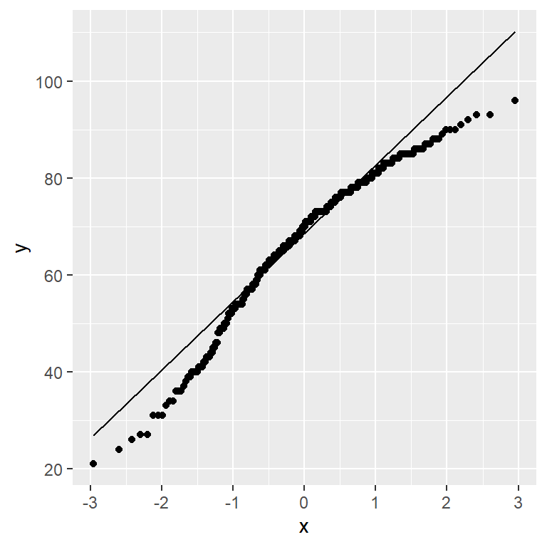
ggplot(exam_data,aes(sample=ENGLISH)) +
  stat_qq() +
  stat_qq_line()
Note
We can see that the points deviate significantly from the straight diagonal line.
This is a clear indication that the set of data is not normally distributed.
Combining Statistical Graph and Analysis Table
Installation of “webshot2”
As “patchwork” only reads ggplot, we will need to convert the shapiro_test results table to a ‘.png’ file in order to display the table next to the Q-Q plot.
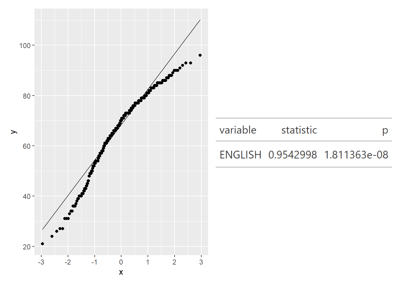
qq <- ggplot(exam_data,
aes(sample=ENGLISH)) +
stat_qq() +
stat_qq_line()
sw_t <- exam_data %>%
shapiro_test(ENGLISH) %>%
gt()
tmp <- tempfile(fileext = '.png')
gtsave(sw_t,tmp)
table_png <- png::readPNG(tmp, native = TRUE)
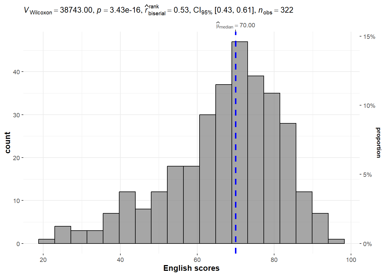
qq + table_pngOne-sample test (Bayes Statistics) [Example from Hands-on Exercise]
set.seed(1234)

gghistostats(
  data = exam_data,
  x = ENGLISH,
  type = "np",
  test.value = 60,
  xlab = "English scores"
)
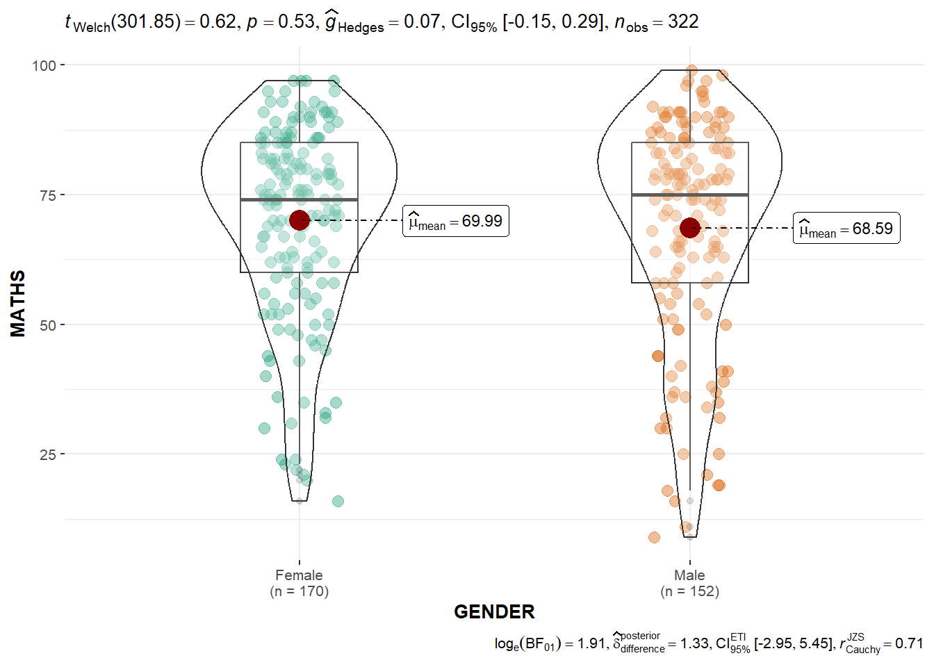
Two-sample mean test [Example from Hands-on Exercise]
ggbetweenstats(
  data = exam_data,
  x = GENDER,
  y = MATHS,
  type = "p",
  messages = FALSE
)